I designed how brands discover and engage with Pietra’s AI copilot by shifting the experience from prompt led value to proof led value.
3x increase in copilot queries
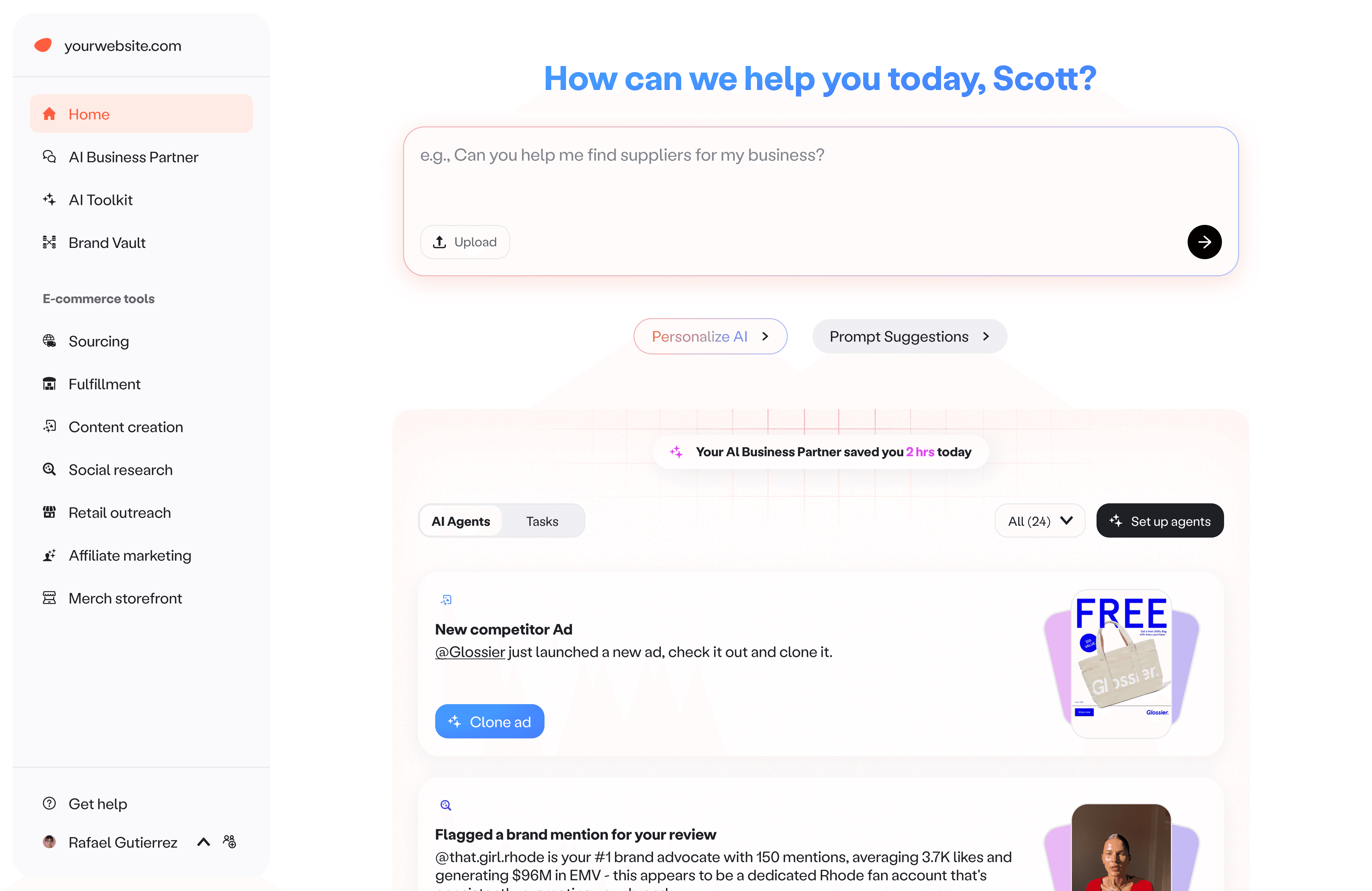
Pietra home
TL;DR
Problem
Pietra launched its AI copilot across sourcing, marketing, and fulfillment, but repeat usage stayed low. Starter prompts and suggested follow ups increased first queries, yet did not build habit.
Solution
We pivoted from optimizing prompting to optimizing certainty and time to value. We introduced a proactive Brand Feed that previewed real outputs from monitored signals, then added configurability and custom agents so each brand could define what matters and how to be notified.
My role
Head of Design, IC
I owned:
UX flows, interaction patterns, and visual design
The prompts and output structure
I worked closely with leadership, product, engineering, and data to strategize, define requirements, test the experience, and ship iterations.
00
/
Solution at a glance
Driving Al copilot engagement through proactive, actionable insights
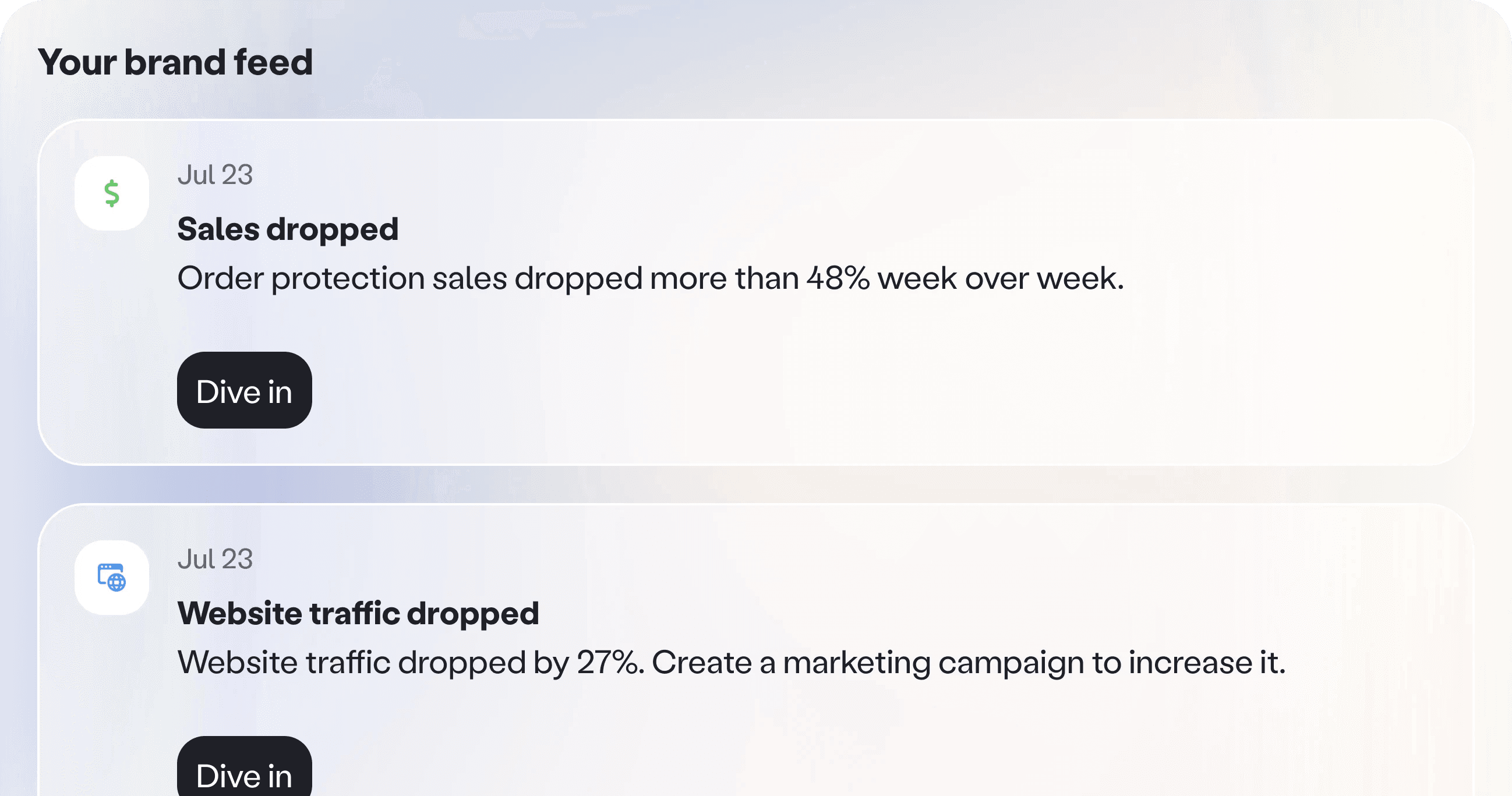
Value on arrival. The moment a user logs in, they see a list of brand updates they can act on right away. No prompting required, just clear signals and suggested next steps.
Pietra home
A way forward. For users already chatting with Copilot, the feed is available inside the Copilot UI. If they are not sure what to do next, they can pick an insight, open it, and keep the conversation going from something real.

Pierta copilot
Set it once, then let it work. Users can quickly turn on the agents they care about most, tweak the settings, connect the right data sources, and update instructions in plain language.

Agent configuration
01
/
Problem
Copilot was powerful, but it was not becoming a habit
Context. Pietra shipped an AI copilot integrated across sourcing, marketing, and fulfillment tools. The vision was one unified assistant to help brands operate faster.
Problem. Engagement was lower than expected, especially repeat usage. Even when users tried Copilot once, many did not come back often enough for it to become part of their workflow.
02
/
An experiment
Make chat feel self driving
Hypothesis. If we guide users to the next best step inside the conversation, we can reduce prompt anxiety and increase repeat usage.
End every response with a clear next question. We updated the Copilot prompt so each answer ended with a question that suggested what Copilot could do next.
Suggested follow ups. After a response, we showed a short set of follow up suggestions so users could keep going without having to think of the next prompt.
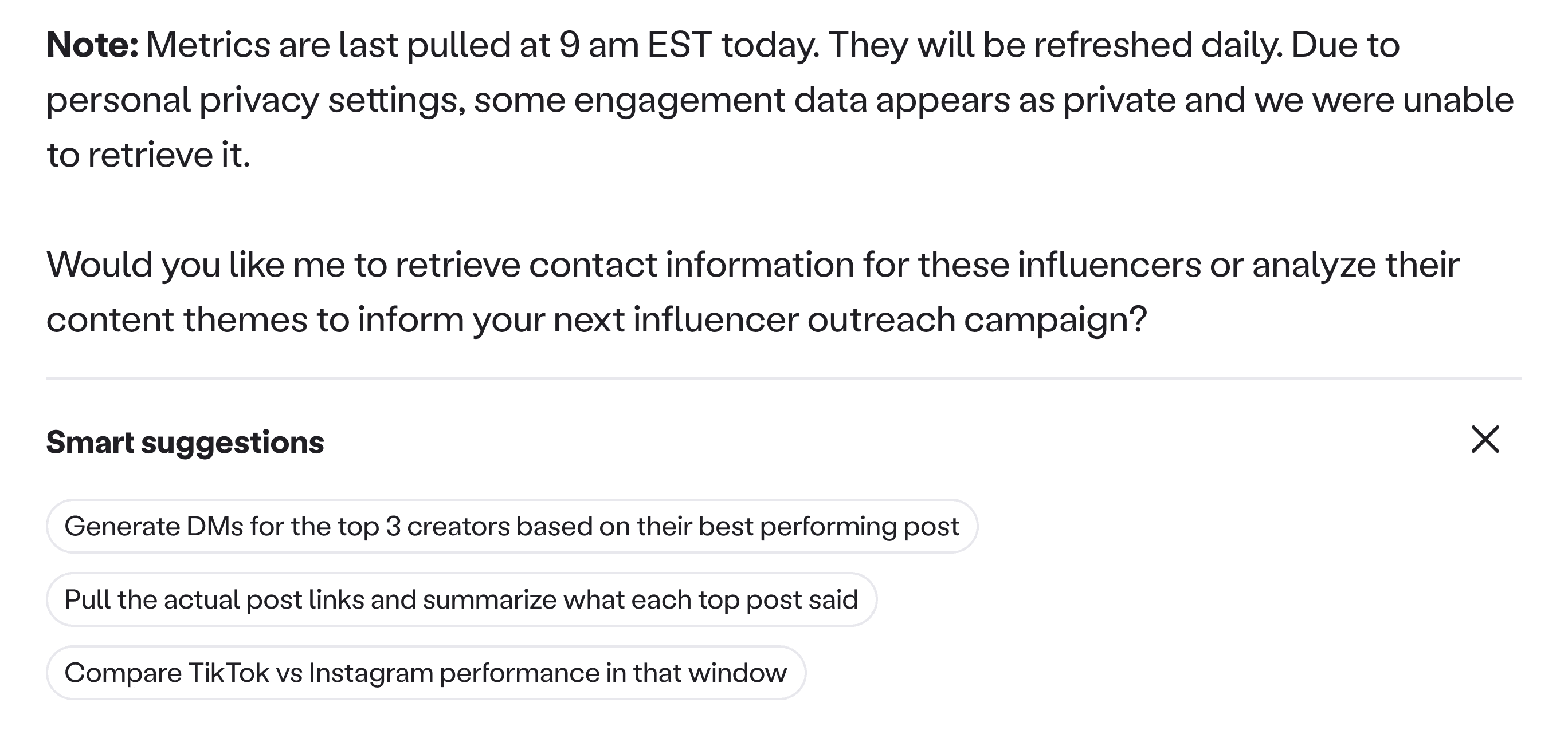
Smart suggestions
It did not stick. Repeat usage did not meaningfully move.
Latency cost
Follow ups took a few extra seconds to generate and render, and many users did not wait long enough to see them.Relevance drift
The suggested follow ups sometimes missed the user’s actual intent, so they felt random or repetitive.
Follow ups were deprecated as they not only added extra wait time without consistently improving outcomes, they also increased model compute costs.
03
/
Research
The retention split: Confidence beats curiosity
Process. I compared conversations from users who asked at least one follow up question in the same session against users who stopped after the first response.
Observation. Users who did not ask a follow up also did not wait long enough for the first response to fully complete. In many sessions, the answer was still mid generation when the user left.
Sales team to the rescue. Our sales team reached out to users who dropped after the first response and replayed the moment with them. When the team showed the completed output, the reaction flipped. People went from skeptical to interested in seconds, because they could finally judge the value.
The insight that changed the product trajectory. We could not fix latency instantly, so we needed to design around it. The fastest path to repeat usage was to make value visible early, without requiring users to wait or invent the next prompt.
04
/
The strategy shift
Turn passive signals into proactive value
A new interaction model. Pietra was already monitoring signals across sales, social, operations, and the broader market. So instead of waiting for users to prompt Copilot, we decided to convert those monitored signals into proactive insights.

Data captured across sales, social, fulfillment orders, and marketing
05
/
Ideation
Exploring delivery patterns
How we landed on the feed? I tested a few delivery patterns to answer one question. How do we show real value early, with the least new infrastructure.
Iteration 1
Summary view. A consolidated report that summarized sales, website, social, ads, competitors, and brand news.

Brand summary card
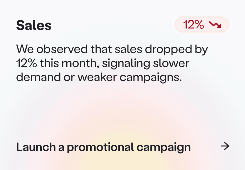
Action got buried. It gave coverage, but it did not create a next step. The most important changes got buried inside paragraphs, so users had to work to find the one thing that mattered today.
Insight. Summaries optimize for breadth. Single updates optimize for action. Instead of one report, I moved towards surfacing specific moments like a sales drop, a product issue, a shipping issue, a brand mention, or a competitor move.
Iteration 2
Dashboard style delivery. I explored presenting individual insights through widget style cards that pulled in specific metrics, and a more complete dashboard that rolled up performance across channels.

Dashbaord widgets
Heavy build, unclear value. This approach assumed we already knew which metrics mattered most by brand stage. It was expensive to build and easy to mislead, before we had proof that proactive insights would drive retention.
Great for steady state monitoring. Too heavy and too easy to get wrong before product fit.
Iteration 3
A newspaper like stream of highlights. Another idea I explored was a simple feed that surfaces individual insights as quick headlines you can scan.
Dashboard widgets
Why it worked. It was easy to digest and scan. It also let us ship with a lightweight card component first, then iterate on richer formats after we proved the behavior change.
Tradeoff. Less depth than a dashboard, but much faster learning for the team and a much lower build cost.
05
/
The product bet
A stream of proactive insights
The concept. I designed Brand Feed, a stream of proactive insights generated from signals Pietra was already monitoring. It gives brands something concrete to react to, and turns each insight into an easy doorway back into Copilot.
Put value where users already are. On Home, Brand Feed is always visible so the product feels useful the moment someone lands. Inside Copilot, so when a user is not sure what to ask next, they can pick an insight and continue from something real.
Brand feed
Designing the cards fast to scan, easy to trust
Card anatomy. I worked closely with product and engineering to decide what we should show on each card so it stayed grounded and consistent, and how these insights should look and feel.
Tailored and polished. Initially, I designed multiple card styles based on the content available. Some cards were text only. Others supported images, videos, or multiple visuals pulled from social posts or ads. In a few cases, I explored adding a single metric when it made the insight more trustworthy.

Feed cards
Two constraints shaped the decision. On busy days the feed gets long, so card height became a real constraint. If cards are tall, users see fewer updates above the fold and the feed feels heavier. At the same time, multiple templates would take longer to build, and they would be harder to maintain and scale as new insight types were added.
The tradeoff was speed versus craft. Until we had proof that people found these insights useful and came back for them, we did not want to spend heavy design and engineering cycles on a complex template system.
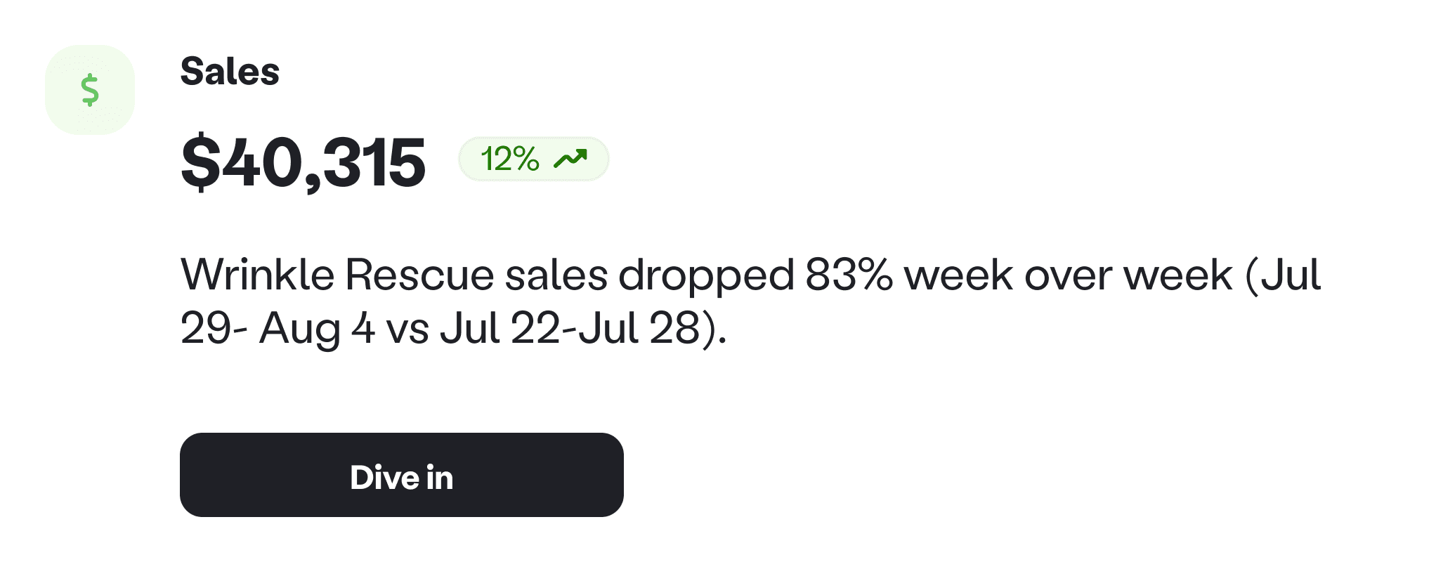
One card system to validate behavior. I simplified the system to one standard card component with two modes: with image and without image. Each card showed the category, what happened, when it happened, and a visual only when we could reliably pull one. Every card also had a clear next step that pulled users into Copilot with the right context.
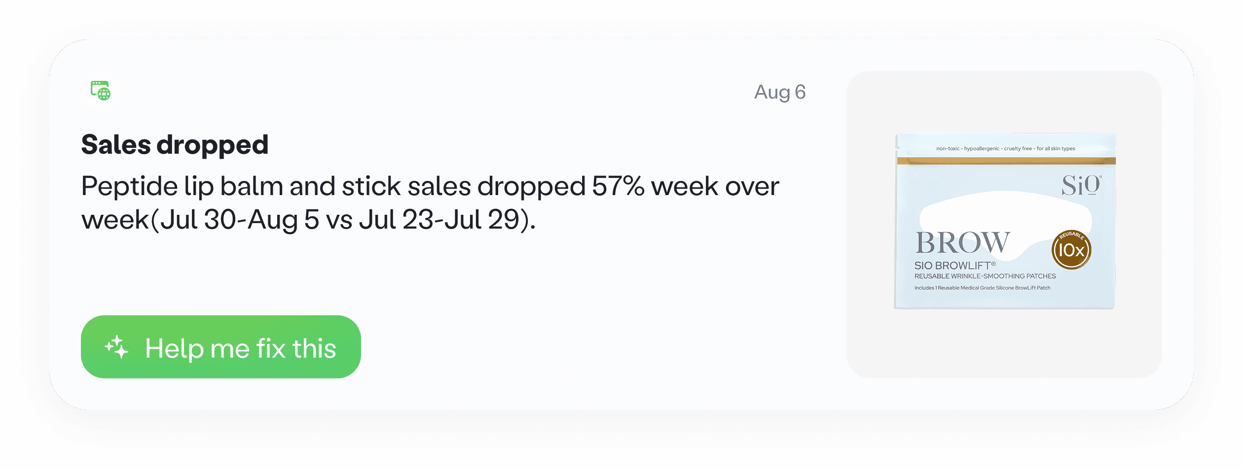
Brand feed card
Start small, prove it works
Shipped 25 insights. We pressure tested a list of potential insights with a few clients, then shipped 25 insights across sales and storefront, website, social, marketing, and content. We prioritized the most common questions brands had, and chose signals that were easy to validate.

Brand feed notifications across different verticals
Impact
Copilot usage increased by 3x. More sessions continued past the first response, because users had something concrete to click into. Brand Feed became a primary entry point into Copilot and drove more repeat queries over time.
06
/
Evolution
From insights to user controlled monitoring
Configurability. Once the feed proved demand, we introduced simple controls to turn monitors on or off and update instructions in plain language, so the feed matches what each brand actually cares about.
Deliver insights where work happens. Based on user requests, we added Slack and email delivery so updates reach users even when they are not logged in.

Feed configuration
What I am working on now
Safer instruction editing. I am designing guardrails for editing, like safely changing variables and instructions without accidentally breaking the monitor.
Preview before you turn it on. Some monitors only trigger when an issue happens, which could be days later. I am building a preview mode so users can test what the output will look like using sample or preset data.
Toward fully custom monitoring. I am exploring the next level of control, a custom monitor flow where users describe what to watch, what output they want, and when to notify, without turning setup into work.
09
/
Learnings & Reflection
A reflection on designing proactive experiences
Output is the product. In AI experiences, the interface is only half the story. Adoption moved when users could see a credible output, quickly, and judge value without effort.
Simplify the surface, not the value. Polish helps, but it is not the main lever. Even when we simplified components and reduced UI variation, the core value stayed strong because the insight itself was clear and grounded. The job is to remove noise without removing meaning.
